
If you are in the Office Insiders group (and so getting early peaks at new Outlook features), you may have noticed that in a recent Outlook update the Search bar has been moved to the top of the Windows Desktop Outlook window.
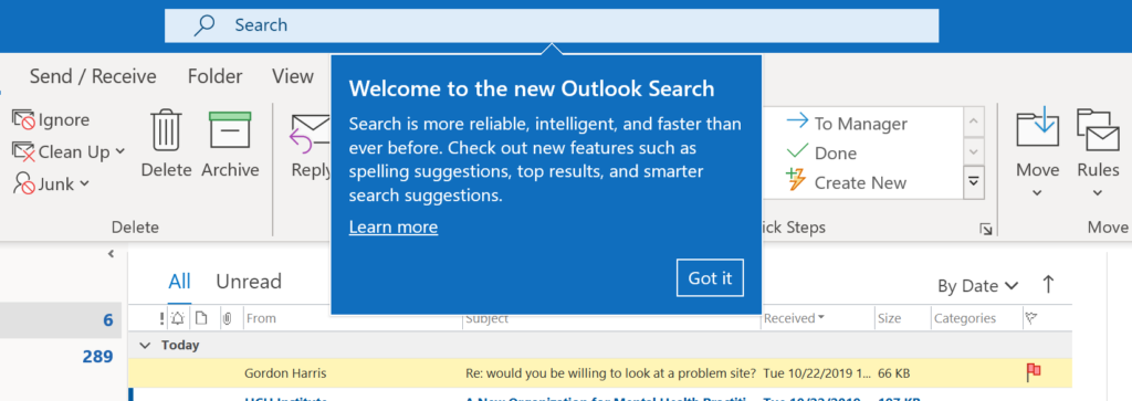
It’s not simply its position that has changed, though, it’s supposed to do faster searches and it does seem to do that. I know Microsoft has been working hard to overhaul the search engine used throughout Office and Windows, and this apparently is a next step.
Update: I’ve just created a free video about this new search box, see this post for more info.
Michael
One of my clients has this update going out to all their machines now. They all hate it and desperately want the old search back. Will you be updating this article with any further news?
the new search bar location is the worst
Interesting. In my opinion, it’s much cleaner at the top and the search is more reliable than ever. Can you explain why this is so terrible for you and/or your users? I don’t see it getting in the way of anything…
no the new search bat is a nightmare , its killing me , im 100 time slower , and im freaking…anoying, can i down grade ?is there any solution ?
at least they should give us a chance to change its location ?
I just turned on the “Coming Soon” feature, which moved my search bar to the top. From my testing so far, the new search is much faster and more reliable than the old version, which was laggy and often failed to find emails that clearly matched my search terms.
Same here, i can’t stand it! i want my old search bar back! help!!!
I fully agree that it’s nightmare and in my case definitely it’s delaying searching process. Few reasons fort that:
– To start searching, you need to click on the searching bar, because there is no easily accessible button on the ribbon. The problem is that when you click on search bar, the ‘Subject’, ‘sender’ buttons are hidden behind the pop-up window, thus you need to click somewhere to hide it… really “great job”
– When you enter required ‘sender’ or ‘subject’ you can’t type further searching criteria, because focus is automatically moved to searching results, instead of searching bar… meaning that you need to click again on the searching bar.
– Previously I could easily select if I want to search through current mailbox, subfolder or all mailboxes, right now I need to click it once, and then once more to access the list of mailboxes
It’s quite a lot of new ‘clicks’ for me, what definitely doesn’t make searching faster, it’s exactly opposite!!! It potentially saved few 0,001 sec., while it cost +2-4 sec! I am really sick of it.
I AGREE WITH THE SAME ..I ALSO HATING THIS NEW FEATURE
I also agree. More clicks & need to retrain my hands to new location – slows me down. Wasted white space now above the header columns.
Agree! It’s in the wrong place, takes too many clicks to do what one click did before, and covers important information. For someone that uses their search about 80 times per day, this has completely disrupted my work day. And no option to change it back?? I pay for this monthly – I should have a say. It’s like buying a white car, and waking up one morning and the manufacturer has painted it yellow – because it’s ‘easier to see on the streets’. smh
Perfect explanation. I would write same. We need option to move back search bar to old position.
I do not like the new search feature !! I would like it moved back where it was!
This is exactly it, it seems like the UI designers were out to lunch on this one, and they could not have possibly done any sort of user click analysis on this, I am clicking all day long trying to search. And now in the spot where there was a perfectly functional search bar, there is just a huge white space. Not to mention is just looks super kludgy up there. At lease make it so we can slide it left and right to help from covering up.
Fully agree.
It is totally unacceptable.
Agree. Same issues being faced here as well.
The worst thing for me is: I can just tell it ‘what to find’ but cannot tell ‘where to find’. It starts searching in whole mail box. I can’t specify a specific sender or subject or body or with in a specific date range etc. So it gives tons of irrelevant results causing wastage of my time in filtering these results again.
Darius says it all. Annoying, frustating pop up box makes searching so much slower!
I agree
That’s right. Add to the list:
– Where do I click/drag to move the window when there’s nothing left to grab onto?
– If you use the outlook main window large or fullscreen and also happen to remote in with Citrix or MS RDC, you’ll enjoy the fight for real-estate at the top when the remote desktop tab pops in and out of auto-hide when you get too close while clicking in the search bar – your option is to not auto hide the thing and either move outlook down, or fiddle with the remote desktop tab to move it out of the way.
Why it is worse?
1- It is not easy to select search box easily as it has the same color as the window bar
2- It requires more clicks to do the same needed search with the old bar.
3- It doesn’t support auto find contacts when you search (you need to type the full name)
A dunce designed this. A redundant dropdown appears over the bar to search from; to; subject; etc.
Here’s one annoyance. When the bar is at the top, and you click on search the drop down covers most of your shortcut tools like “from, to, contains in subject”. I hate that I can’t get to them. I have thousands of emails with keywords in them, but only a few with the subject line. I don’t like it that I have to write out from when outlook went through the trouble of giving me a handy shortcut that is now hidden. This is just a bad placement on the screen. If you wanted it to stand out just change the boarder color, or highlight the search field. It’s been a year, and I’m still wanting to move it back.
A search bar at the top, if the window is reduced, reduces the available space to click and move the window around.
Just 1 of many reasons why this new feature was not thought out and frustrating. New bells and whistles are only good if they enhance, not impede work flow.
The word “cleaner” sums up the issue. It is an aesthetic change by some UI designer. This is the type of decision that is made for no real good reason at all. The millions of people who use the search function dozens of times day have to train themselves to go to a different location in the window to find it just because someone thinks is looks “cleaner.” I understand the functionality can always be improved for the queries but why move it?
This basically sums up my impression, as well.
Moving the search bar away from the thing to be searches takes it out of context creating a bit of a mental speedbump every time I want to use it.
You can’t even use the paste function from your mouse by right clicking.
They down graded the Search function and made it mandatory. How does this get past QC
Those UI Designers should be fucking fired!
How did it get past QC? Do you remember Windows 8/2012 initial release? the one WITHOUT a start button?
At the very least the change should be an “Option” not a manditory change so people can have the choice.
MS make so many seemingly arbitrary changes that total frustrate their consumers and that if we knew who they were (the people in charge of making the changes) they would probably be murdered by the thousands of us being driven insane by their hated changes.
Please please please, make good sensible changes not stupid ones and call them and upgrade. We are not idiots, we know what we like and we know this is not an upgrade even if it is faster….
Just had the update with Search box shifted to the top. I’d have to agree this is dreadful and unproductive. When will Microsoft understand that mostly Business software needs to be about functionality and flexibility, not to be aesthetically pleasing.
…and that it bucks good UI design practices. Just because you can put text input widgets where ever you like doesn’t mean you should.
It’s a case of affordances: top window bars are traditionally to identify what’s in the window and give you graphical ways to fiddle with the window. They are NOT used as part of the functionality normally. That conceptual shift is not free, and so change for the sake of “keeping the app fresh looking” degrades the quality if you don’t pay attention to the user interaction and goal.
The autofill prompt covers up the essential filter buttons (from, attachments, time frame) !!!!
The bar needs to go back to its original position.
Earlier there was option – Serach from Inbox or sent folder but in new search bar there is no option
FOUND IT,SEEMD TO BE GOOD & FASTER
This change in position slows me down. Having to change eye position over and over again when it was in the correct location to begin with…. I feel like it’s people trying to rework something instead of improving…probably to remain relevant…it’s a fail
Totally agreed. i need to move mouse and my eyes way up to the top. i just want a simple way to search my inbox.
CAN’T COPY AND PASTE INTO THE BOX!
Use Ctrl-V. (We old people remember this from way back when we didn’t have a mouse!)
There is no longer copy and paste nor drag and drop features. I hate Microsoft!
I agree,with this guy! The location is inconvenient, the search is far less accurate and I have to change it to search all outlook items every time I run a search. Since the update, I have literally been able to only find one item I searched for. And it tell me something went wrong for every search I do, even when I’m 100% sure it’s something there.
I feel as if my hard work with settings, bookmarks, email, etc has just been stolen. No browser, access to Outlook Mail which is covered by a Search bar, and on and on…The unilateral decision made by the Company to mess with people’s computers is monstrous, reprehensible and should be removed, unless positively stated otherwise by users, asap, and the user’s browser, and other functions restored.
Mark, two main reasons (i think it’s slower and less reliable, but I’ll ignore that for now).
1) the search tab is gone. It was faster to click on that if you wanted a search filter like “From”, “To” or “Has attachments” and then outlook would autofill that and put the active cursor in the search bar.
2) Now you have to click on the search bar, which opens a drop down menu of your recent searches that covers the entire search tab so you can’t click on earch filters like “From”, “To” or “Has attachments”. So you have to click on the bar, off the bar to close the drop down menu, and then back onto the filter buttons. It’s incredibly frustrating and inefficient.
It’s a horrible change by Microsoft.
I so agree – they just pushed it out on our computers – ARRRGGHHH – I feel like someone just cut off my right hand!!
The search bar in the old position (right above the Inbox) was highly convenient, because one didn’t have to take the eyes off the inbox to access the search box. Now, one has to take eyes off the inbox to go up to the top and put the search strings in and then look down back to the Inbox to review. This seems minor, but for most of us who are so used to the search box being part of sifting through the e-mails quickly, the new search box location is a HUGE annoyance.
agree. how do we get it back?
You hit the nail on the head. This is exactly my annoyance with it. What was always right there, ready to use, is now some far flung away feature that seems like an enternity to find when previously it was always just, there. I know it’s just at the top of the screen, but it’s so detached and out of sight, especially if you use a large screen.
You are 100% right! I can’t believe someone thought this was a good idea. I know there are more important things in the world, but this really Cheeses me off!!
Its not a good change because when you try searching the Suggested Searches, Recently used Actions, Suggested Actions window block the other useful filters on the Search ribbon.
It was in a perfect location….right above what I was working on, and searching in the area I was working on. Now, It’s in another area of the screen. It was such a useful tool, that I never needed to create folders, and used the search to find everything.
the problem is that when viewing incoming emails your eyes are at a certain level and now, to use the search bar, it is not natural to look up, a good 4 – 5 inches from the incoming emails. I do maybe 15 – 20 searches a days and it’s irritating.
When you click to search, it blocks search options such as “To”/”From”/etc. There is no reason it can’t exist in the old spot and maintain the faster searching/etc. This is dumb.
my issue exactly-can’t use all of the filters!!
DUH
With the old search bar, my mouse cursor moved a mm to get to search from the email list. Now im going up above the header where ive been trained for a decade that there shouldnt be anything. Took me 20 minutes to find the thing the day they moved it.
Yeah, it sucks because sometimes you can downsize the window accidentally….
When you click on the new search bar, the history drops down and I cannot click on the from to hasattachment buttons. I have to click the bar, click outside so the history disappears, then I can click on the from to subject attachments section. It is a PIA.
OMG terrible. Like totally confusing to see it at the top there. I don’t like change unless it’s a kaizano!
For starters the drop down cover the filters in the ribbon. Secondly, I’d grown very accustomed to it being on the right, not the left/center. Just a preference. But the first issue is bad UI
I too loved the way microsoft manages the bars, no need to stick on traditional way. changes are good.
It was right at the top of the inbox…close is always easier. Now it is a full inch up and why change the position? Improvements in the search engine are great, what does moving it accomplish?
For me, i use the “From” or “has attachment” options all the time, and with the search box above those, there is a “Suggested actions” box that drops down in from of those buttons, making it difficult to use them.
The second you click in it, an automatic drop menu obscures all the search criteria in the top ribbbon. You now have to hit escape i. Orde to clear it and the. Hit your search criteria, I.e. subject, has attachments, to, from, etc.
its horrible. my entire team at work can’t stand it either.
Having it in the title bar is terrible because… I’m on a Mac, and if I want to MOVE the app window, I have to click Very Carefully in the tiny space between the min/max buttons. More often than not, I accidentally hit the Search bar or the min/max buttons.
I agree. Really hard to use and you cannot place the criteria in the order you like
This is terrible. It does not find ANYTHING, it does not work at all. What is the fix, how to I go back to the old and working, from this new and disastrous?
It’s like comparing a Camaro (new search bar location) to a Trans Am (old [and better] search bar location….
you can get rid of the “top results” that has completely erroneous things in it and screws up the date order.
Go to File>Outlook Options>Search and UNCHECK “Show most relevant search results on top”
Hope that helps!
AGREED!
It is the worst update I have ever seen. I think the creator or the owner is someone mind-bogglingly organized. I am still thinking that this was generated by humans an I wrong ?
Agree!!
I agree – I hate this new update! It’s too high up on the screen and I am not a fan. They should at least let people have the option to keep it where it was or put it up on top! Ugh.
Any heavy user of outlook would agree. The extra real estate that you have to cover is not acceptable. An MS rep responded that it works well with the Simplified Ribbon. Unfortunately, the Simplified Ribbon does not work for heavy users of the product.
Hi, Alex.
It also happened to me, but I returned it back to its original location. What I did is that I only just turned off the “Coming Soon” label (with box icon) on the upper right corner of Outlook’s home page.
Hope this could help:)
this really helped. Thank you!
Thank you.
I thought MS has fu***** lost it.
I hope they aren’t going to force the change on us
OMG! Thank you!!!!!!
Amazing. Thank you!
Now … can you tell me how I can re-implement Outlook 2010!
It works !!!!! Thank You…..
You gave me my sanity back! It’s fine if MS wants to make it faster but there’s no need to move the location, which I hated.
Nice. Thank you very much for clear instructions. I must have turned on “coming soon” by accident. Turned it off, and it returned Search box to original location. Thanks!
Hi Alex
I cannot locate the ‘Coming Soon’ label anywhere. Could you let me know here I can locate it please? thank you Julie
same here, i don’t have this option 🙁
same, search bar is moved but can’t find coming soon button to move it back…
Yes, as of May, it seems to be a permanent terrible move, no longer “coming soon.”
Thank you. Great save. I also hate it. For me, it is all about not having to move my mouse that extra inch.
Yay! Just tried your suggestion and the search bar is back where it belongs. Thanks for making my day (it’s the little things).
awesome! Thank you!!!
OMG! Thank you! This helped me so much, just the info I was looking for! Returned it right back where it needed to be. That change threw me off kilter and it was annoying. Thank you again.
You are so great) i spent my 2-3 hours for getting back of search location, but it did not work. i even watched 20-30 videos from youtube. But your suggestion solved this problem.
God bless you)
Thank you Thank you!! I was pulling my hair out :*)
Thanks Marianne. It really helps.
Thanks, that worked for me.
You are an angel! Thanks.
OMG You have saved my sanity. Thank you so much!
Amazing zing zing..Thank you
That’s it! Thank you so so much.
Thanks a million, was getting mad
i did but it is still up there 🙁
Hello,
I can’t find it…can someone screen shot it for me…PLEASE!!!
Oh please someone screenshot… I cannot find that option either. Hate this new location/function for Search.
It seems MS have now launched this feature (it’s no longer ‘coming soon’.) Even if it offers a cleaner interface, it’s crazy having a drop-down menu covering options on the ribbon. Until a fix is found, one option might be to pin the Search tab so that it’s permanently accessible and accessing that instead of the search bar:
How to add the Search tab to the ribbon
Right click on the Outlook ribbon.
Select Customize the Ribbon.
Select Home (Mail) located in the list on the right-hand side.
In the Choose commands from the list on the left side, select All Tabs.
Under Search Tools, select Search.
Between the two lists, click Add to move Search from the left list to the right list.
Click OK to finish.
Acro_d has it exactly right thank you!
I will just add that for some reason it was not letting me just right click on the ribbon so I had to go on the left side where the Print and save Icons are there’s a tiny drop down menu “Customize Quick access tool bar” then “More Commands” once there it pulls up all another screen and you can follow the steps as Acro_d wrote.
Also yes the “Coming Soon” tab has disappeared because they did fully turn it on for everyone.
This unnecessary change of the search bar really pisses me off & do hope they change it back – I sent in very pissed off feedback about it – everyone else should too so they get the message faster.
how did you feedback?
I didn’t like the “Coming Soon” label and thought I had turned it off before I removed it from my toolbar. Now I don’t know how to get it back to return the Search box to the original location.
Hi Marianne, i cant no able to find it
where”s the coming soon label? can’t find it
I can’t find the icon you are talking about. This is really horrible! Microsoft, DO SOMETHING!
It also happened to me, but I returned it back to its original location. What I did is that I only just turned off the “Coming Soon” label (with box icon) on the upper right corner of Outlook’s home page.
Hope this could help:)
Thank you! The new search doesn’t allow for multiple search features at the same time (to or from name, attachment, location, etc.) and has made it so much harder to find information.
YAY! After tirelessly searching for information on how to put the search back where it belongs… I find this. Thank you ever so much 🙂 I hope it stays…..
Thank you I had same problem last night looked and tried everything I found this page tried what you had put and it worked
Thanks again.
Yes, bring back the old search bar, you cant even copy and paste.. This is essential for this business..
HELP I agree! i HATE I want to move it back. I use 3 emails and want those displayed at the top.
CAN’T COPY AND PASTE INTO THE SEARCH BOX!
I agree — this feature is dreadful. Any way to convert to previous setting? Otherwise, I’m moving to Thunderbird. I really rely on the feature heavily and it’s just too darn frustrating.
This is a “Semi” step back – Great article and helped me
https://www.online-tech-tips.com/ms-office-tips/search-outlook-email/
June 2020 and I just found out about it. UserVoice link is here to vote for the change: https://outlook.uservoice.com/forums/322590-outlook-for-windows-desktop-application/suggestions/39046513-search-at-the-top-option
I must admit, people who are up and chippy about these changes, must be so wrong inside. You don’t work with mail groups, you don’t work with shared mailboxes, you don’t work with multiple mail boxes dedicated for specific clients.
At times 60GB of emails. And the funny bit? Indexing doesn’t always work right. yes! Indexing is far worse than anything I encountered on a personal computer ever. Don’t give me advice on how to fix mail files. Don’t tell me how to reindex.
Just accept it, shilling is all you do best.
This article says “suck it. We’re not changing it back”, “voting closed”. This is the WORST update they could have ever done!
The whole office hates the new position. Its too inconvenient to move your mouse farther and then go back to the scroll bar. The old position is perfectly fine.
Remember people want simple and quick access.
SAME HERE. You can’t even cut and paste to search. I ABHOR IT!
I hate it too. I work using a lot of (req)uisition numbers that correlate to specific reqs so when I get an email about a specific req I like to search my inboxes for all emails concerning the req. With this new search bar I can’t just highlight and drag the req number to the search bar, I can’t even paste in the search bar without using crtl+v. So long story short, I also HATE it and desperately want the old search back!
Oh wow, thanks, didn’t think to try CTRL+V, that works for me! Yay!
I truly hope they add the option to move it back. The dropdown with suggestions gets in the way of the toolbar. My users all hate it. They really need to think things like this through….
get over it ya dam plebs
It’s a minor annoyance, but I don’t love it.
Glad it is only a minor annoyance for some. Not so here.
Whole day im trying to find option to move search box from the top and now i found this blog -.-‘
Yes. me too….
Same here. I spent almost 3-4 hours trying to go through the different View settings and landed on this page, finally. This should be at-least backward compatible.
So near real solution to this but have to stick with what big brother has done?
I do not like this at all. Like some others said at least give us the option to move it back; I do a lot of searching, I do not find this easier I actually find it more awkward. Blah Microsoft
I hate it. It’s a long stretch with my mouse, to move all the way to the top of the toolbar and it gets in the way of my ribbon. All the options that pop in, also makes it feel cluttered.
Tank you.
Is anyone else having an issue where when you click the search box, all of the search options show up in the main tab area, but trying to click into the search options takes focus away from the search box which makes the tab area go away..
End result is I cannot click in Search, then select FROM, for instance. Very frustrating.
Yes, I am having the same issue. Hate it!
Yes same issue, very frustrating.
Just click on the blue top tool bar and the “suggestions” window dissapears so you can click “From”. I do agree that this isn’t ideal and they freaking removed the right click – paste option and highlight – drag option from this search box!
What N Peep says; how annoying is it now to be able to select “From” or “Subject” in the toolbar, as the search dropdown blocks these buttons? My colleagues and are really disliking this change. It takes soo much longer to find something now.
How can this have passed any UAT?!
Guys, while it is annoying how much Suggested Search drops down, all you have to do is tap the ESCAPE key on your keyboard and the Suggested Search drop-down goes away, opening up access to the Search Tools Ribbon (and things like the From or Subject buttons on the Ribbon).
What N Peep is saying sounds different, however—that the Search Tools Ribbon actually disappears completely, even after the drop down is gone. And no, I have not seen that. The Search Tools tab stays active in my usage so far, as long as the cursor is still in the Search box.
I hate it as well. I can’t get used to the location. I work on 2 large monitors within 6 – 8 programs, where they placed and do not allow you to move it is not only dumb but frustrating.
I second this – Hate its location now. Please give us an option to move it back. Geez how can MS not realize this when do these changes?
I use outlook on three machines. All have he same build and only one has the search bar in the quick access.
same here!
unclick “coming soon” and keep complaining – its a pain in the backside.
i rolled back a build but don’t have the “coming soon”
I also do not see this bloody “COMING SOON”
And I absolutely HATE this new location.
Would it help to do a SYSTEM RESTORE on my computer to an earlier date perhaps?
Why change something that WORKS??
Sorry rant over, just so damn annoyed as it really slows one down if you are working on a few monitors at the same time.
haha you’ll get used to it after 5 days, trust me!
It is TERRIBLE!!
You now need to click to search, click the mailbox folder you want to search within, then click again to choose the folder. It used to be 2 clicks. Now it is 4. Seriously.
Why did they make it extra clicks? One of the worst updates Microsoft ever made!
My users also hate this “improvement”…
This is the part that baffles me. On one PC, I installed via the O365 portal and then ran updates and the search bar is at the very top. On another PC, from the same install button in the O365 portal, install and update did not move the search box.
can’t paste in that search bar, what a joke
Ctrl+C and Ctrl+V
Mike
Thanks for the tip to use ESCAPE to remove the suggested search dropdown. Solved my frustrations!
I have two installations (laptop and desktop) of the same outook365 subscription, both updated to the SAME release and one has the search bar at the top, and the other is the usual place: above the emails. It cannot be any more weird.
I have an older coworker who has had serious confusion related to this update.
Why not make the search location optional??
I appreciate your blog post, I could not figure out how she had gotten it up there.
Thanks
Yeah don’t like it at the top, its not a natural position for a quick search.
Ctrl-E or Alt-Q pop you right into the search bar. I still would prefer in the old location though.
No ‘god’ we don’t have to accept something for the sake of change and or some antiquated ideal that society is constructed of stratified classes – and that people who complain are of the lower echelons, we are not, we just want to make this world a better place. Chucking all is not healthy, praxian change. If the change was about creating a faster search tool, did we have to move it to accelerate it? So why is it a hassle? Distance, distance from the information I am seeking, I adjust the order/ or change the whole word letters-symbols within the search history, the new position of the search bar is like looking back two pages, it slows down the work. I use Outlook as an archive system I research every living moment of the day. Frustrating, tis all i can say. This is the first search bar placed so far…most dictionaries including the Outlook Dictionary is immediately above the search request.
did u find a solution
Just to start – I agree the new position is annoying BUT because it has moved, it allowed me to find new Search Options in the Quick Access Toll Bar!
For example, some people complained about the “From” button being blocked from view due to the suggestions box. You can just click the blue bar or escape key and it goes away OR you can add a new Quick Access link to “Search by sender”!
If you click the Down arrow next to the left of the search box than “More Commands” you will find a SLEW of other search options requiring only 1 click to execute (like Search by sender). Personally, I like the “Search current folder” option so I dont have to click the down arrow to change from “Current Mailbox”.
So now I have 6 or so icons next to the search bar that with 1 click I can search based on the sender or in the folder I’m currently browsing…. I also have, Quick Print, Undo, Send/Receive, Speak, and Open Documents Folder. These options DID exist before but now have become easier to use (since its next to the search box now).
I’m just saying… I do not like the new position but it has clued me into new features which I like – take a browse of those other “Quick Access Commands” and see what you could add to the top of Outlook to make like easier.
Good idea, thanks.
Is it possible to realign the position of search fields to be able to achieve maybe a from, to, subject, body etc type positioning? It was possible earlier
Yes, could easily tailor search operators before and be in with one click close to the data
It’s very annoying and inconvenient to use.
who approved such a change doesn’t care to read all the above feedback ?its stupid move , its stupid , its annoying , i’m so angry that i cant even write properly , its more that stupid , put it back
Is there a way to move back the Search bar to its original location?
In the top right corner of Outlook you should have the option for ‘Coming Soon’ with an on and off slider, select ‘Off’ and restart Outlook, this will move the search bar back to it’s default location.
Thank Rhys, that helped very much. I also took the oppurtunity in the “coming soon” to mention it is such a bad location
Thank you! That worked.
Thank you! I’ve wasted several hours trying to figure that out.
Thank you. I also re-wound and now have it in the right place. I’d also wasted several hours trying to figure it out.
If i haven’t coming soon option what should i do?
thanks
THANK YOU!!!
Man that was bugging me like a stone in my shoe.
Hi Rhys, the “coming soon” on the top right of outlook is no longer there. Are we now stuck with the new search location?
I’m not sure what the stink is about. It seems like a good use of space to me. That title bar is sitting up there doing nothing anyway. Why not move the bar up there and free up those pixels from the messages column. ¯\_(ツ)_/¯
Ctrl-E or F3 will get you to the search bar in Outlook. Now your mouse hands won’t get tired from that extra inch you have to move up the screen.
https://support.office.com/en-us/article/keyboard-shortcuts-for-outlook-3cdeb221-7ae5-4c1d-8c1d-9e63216c1efd#bkmk_search
LMAO! I love the shade in these comments. Day made!
Good job no-one disabled needs to use the keys on the keyboard rather than the mouse
Missing Ctr-E & F3 on my mouse.
I’m not sure if this will work for you but it did for me in one instance.
– open “Run Command” outlook -safe
– you will see that the search bar is still on the top bar
– close Outlook
– run Outlook in a normal mode and hope if does work
– if not I’m really sorry if it didn’t work
This also worked for one user here.
This happened to my colleague. She is not stuck with it. I simply had her turn off “Coming Soon” (she thought it was a cinematic thing and got annoyed when her search bar was moved)…Outlook prompted for a re-boot (just a warm, not a cold)…and voila! Search bar is back in the old position. 🙂
DANG…it worked. Turn on/off “Coming Soon” then exit outlook and reopen. BTW, this too proves Darwin was confused.
Excellent, Thanks Denise. Your suggestion works just fine.
Right on Denise! This fixed it back to where I get all my additional search fields showing. You rock!
I do hate it when they change things like this. Why dodn’t they leave things alone. I suppose because they would lose their jobs. Same with Word, Excel etc. I just wish they wouldn’t keep changing things that work perfectly well and then you have to waste time learning how to do it again. And I don’t think people should tell us to “get over it dam plebs”. Who does he think he is “god”?
Is there a way to put the search bar back where it was; it’s painful to have to have it at the top and use cntrl+v every time.
Very nice
I hate the location
I agree with most people, its annoying, not helpful and it MUST be a “Choice”, not an imposition to do as told, and that is it, real bad move from Microsoft, in order for people to accept changes, specially, they must be presented with the characteristics, and you, the “Buyer”, the user, the consumer, MUST have a choice.
I believe the GOD response was uncalled for, and he needs to realize, that in the Cyber Realm he might be a God, but in the “REAL Realm” its just another human trying to survive this jungle of life, as HD says “Be good to one another”
To change this, you may need to change your Office Channel to semi annual. this appears to be happening with Office insider, monthly targeted and monthly. https://erwinbierens.com/switch-office-2016-to-monthly-targeted-channel/
Please vote at:
https://outlook.uservoice.com/forums/322590-outlook-2016-for-windows/suggestions/39046513-search-at-the-top-option
With the “new search bar” I can no longer paste into it. This is very frustrating – as I usually will copy a number or email address. To ensure I have it correctly, I prefer to “paste” it into the search bar to get the correct results. PLUS I use copy and paste all the time. I do not understand why this no longer works. Any help would be greatly appreciate it. Thanks.
I totally agree with the ones who doesn’t like the new position of search bar. Not only the position, but also the working algorithm. I’ve not measured searching duration, i may agree it’s faster than the old one, but for me, trying to create new search habits takes out all the advantages of getting faster results. Please follow the engineering rule, if it’s working well, don’t touch it !
We work in virtual mode and the search bar gets hidden under our virtual bar! It’s so frustrating. I have tried to move my virtual bar but the only place it’s not in the way is at the top of the screen. I have to move it every time I need to search Outlook. My screen also minimizes every time I use the search function now.
Is there any way to get the Search Tab (with all the search tools below it) to stay permanently on the ribbon? It only appears transiently when clicking the cursor in the new search field, which of course immediately covers up up the options with the drop down menu! You can finally access it then but once you move on to any of the other permanent sub-menus in the ribbon, Search disappears. I’m all for contextual commands but this is implemented backwards in my opinion. I can’t figure out how to customize the ribbon and add it permanently.
absolutely the worst possible place to put it. Heck you can’t even do a copy and paste from what I can see in the new search bar?
You cannot Right Click and Paste what you want to search in this stupid search bar. Have to turn off Office Insider to get back the old search that works.
Outlook is basically still the same program from 20 years ago as nothing has changed for the better.
I will be moving full time to new improved Gmail with my GSuite once my 365 year expires. What do the staff do at MS office as they are still stuck in the 1970’s!
This search bar moved to the top because you turn on Coming Soon feature. To move it back just off this option and restart Outlook.
Wahid, You just saved me!!!!
Many Thanks! I trully hope Microsoft drop the idea of moving the search bar.
Brilliant help. Anxiety reduced
Ah, now that I have found the search button, im happy. Really Cool and I like the added options.
I’m very happy to know I can turn off “Coming Soon” and get the old search bar. But it seems like that will only be a temporary fix. Does anyone know when “soon” is likely to be and whether we’re going to be forced to adopt this new search box once MS rolls out changes?
I also am NOT a fan of the new search. I truly hope that MS will hear their customers and provide an option for those of us who want the keep using the existing search as is.
Turn off Coming Soon and restart the app!!!!
the new search location is the worst! Not user friendly! Can we please ahve a n option to put it back where it was?
U ROCK!!
I was unhappy at first when the search box moved. But, this is much better at constructing defined searches and much faster, at least for me. I also like that MS finally decided to put color back in the title bars for Office 365. I hated accidentally closing the wrong widow when I had them stacked and they all looked the same.
As soon as we get comfortable with where something is… it moves, changes on its own, or disappears. I wish the updates would come with a heads up…. with opt out/ opt in for specific settings or locations. Instead people have to waste time looking for solutions and dead ends, when the crap changes right in the middle of using it. I hate when others are always thinking they know what is best for me, so they limit my options.
I don’t see any difference in the searches (speed, more defined, etc…) whether they are at the very top or at the top of the list of emails.
I simply prefer the location above the list of emails. It is more convenient.
Thats wonderful if you are not running 10 different email addresses in outlook…
TURN OFF THE THE BUTTON COMING SOON TO OFF AND RESTART OUTLOOK AND YOUR SEARCH BAR WILL BE BACK TO NORMAL 🙂
iJUST DID THIS NOW
The coming soon button is no longer there.
F U C K I N G Microsoft (and Apple for that matter). STOP changing shit that doesn’t need to be changed. Make my life easier, not harder. There’s plenty of new shit to learn in the world, don’t waste people’s time with moving a F-ing search bar from where people were used to seeing it. Why why why? Tell me what’s smarter about this now. Idiots.
Amen. I hate when they move things. Fine, the search engine might be faster, but why does the input box need to move?
What a bunch of christly numptybollocks who came up with this change. You eejits, Office is PRODUCTIVITY software. Were people complaining about the location of the search box? NO THEY WEREN’T. Sakes.
Can you guide how to remove the new outlook Search and return back to old where there were option of multiple search criterion
Got this new search and it’s a pain, doesn’t actually return any results now. Just get “something went wrong and search couldn’t be completed”. Useless.
coming soon button is now gone, and even the registry edit doesn’t work
This is ridiculous. Having the search bar on the top of the screen is time consuming and a PIA. Move it back. No, this isn’t a thing about avoiding change, this is about being more efficient. Having to click out of the central screen, move the mouse up and then search is ridiculous.
I know you didn’t make this change….
all the comments are negative becuse the change is negative…it takes more time to search now…and it won’t get faster in the future.
the distance to move the mouse to search has increased…its farther away from the emails which is where we spend most of our time
Some changes are annoying cause we have to change muscle memory, but it might be better in the long run. This change is bad all around and won’t improve with age
With the new set up, I am unable to copy and paste text into the search field. This cripples what I do each day. Terrible change.
This is not just some ‘need to get used to it’ change and we’ll be okay after an adjustment period. Rather, it’s a major decline in efficiency for heavy outlook users.
The extra distance to scroll up the top of the screen is bad enough, but no right-click/paste is killing me. Having to use ctrl+v keystrokes to paste and then hit enter to search is a major problem for someone who has to search 100’s of time daily.
If they don’t fix it, I’ll be looking for a new email platform
No right click and the annoyance of having to clear the dropdown is stupid. It takes about 6 clicks instead of 2. Why are MS wasting time doing things like this instead of fixing the bugs and issues we keep raising with them.
This is horrible. I came in today and it had just changed…..I run multiple companies email folders through this and each company folder had a search bar. Now I have to search through one bar at the top of the page and double check I am searching the correct company…..so time consuming….
I never saw this ‘so called’ button. Unable to change back even using suggestions provided here…
Same for me, I’ve now tried everything –
Hate it. Hate it Hate it.
Every search “Something went wrong and your search couldn’t be completed”. …”looks like there is a problem with your network connection. Let’s look on your computer instead”.
There is no issue with my network, we just use an external service to provide email. Basically the new system has broken searching altogether without following a second link. It takes longer. It displays irrelevant options. It automatically hides items because it decides they are worthy. Please let me go back to the old version!!
I have these errors too on every search!
WORST f&%# update ever! And for those who say ‘get over it’ – go back to playing your video games. Some of us actually work and a few extra clicks or having to stop and look for a search bar is counterproductive.
I did this and it worked however the next day it changed back with no coming soon ? Help
he new search bar location is the not user friendly, please we need the old option back.
the new search bar location is the not user friendly, please we need the old option back.
Ooops! There isn’t “Coming Soon” button. What can I do to return search back?
Some Ideas?
I’ve tweeted them. We should all do this!
Not working for me at all!!! Change it back or give us the option to move it back?!
The search function doesn’t work at all.
When I type in a keyword, I get a message saying
“something went wrong and your search couldn’t be completed.”
Underneath that there is a message saying
“Let’s look on your computer instead” I click that and it produces the search results.
However, I want it to work like it did yesterday… just show results as I type the keyword.
I’ve already tried rebuilding the index, but that did not solve the issue. I will try a scan and repair to see if that works, but I don’t think it will.
well its looking good. however its getting time to familiar to new system once you got its easy. since morning I was the same issue later on I find the way. thanks a lot for new features.
https://outlook.uservoice.com/forums/322590-outlook-2016-for-windows/suggestions/39046513-search-at-the-top-option
VOTE
Looks like this change is gaining some momentum on Microsoft’s site… go here to upvote so we can get back to our optimally-functional ways!
https://outlook.uservoice.com/forums/322590-outlook-for-windows-desktop-application/suggestions/39046513-search-at-the-top-option
Thank you for posting that. I was about to!
The search bar has been deleted on my iPhone email as well. Anyone know how to find it there?
Praise God to the reply that noted the “coming soon” on button. Search bar was HORRIBLE in the upper ribbon location; terrible waste of time. Don’t mess with a good thing.
Wait, you still have the option to change it back to the old view? I no longer have that option.
You want have that option once the actual update that is “coming soon” gets updated!
Sometimes MS UX designer are just flat out terrible. Anyway’s to move the search box to where it was, you can turn off the “Coming Soon” option on top right corner
Why would anyone travel with the eye all the way to the top of the screen to the newly positioned search box there when the eye is focusing on the calendar. You are asking the user to look across too much away from where the information is needed. Please put the search box back where it used to be: RIGHT ON TOP OF THE CALENDAR DAY FIELD. Keep it simple the way it used to be !
The new search location is awful. After trying, unsuccessfully to find a way to move it back, I finally reverted back to the previous version of Office 365:
https://support.microsoft.com/en-us/help/2770432/how-to-revert-to-an-earlier-version-of-office-2013-or-office-2016-clic
I’m now running Version 2003 (Build 12624.20466) and the search bar is where I want it.
Don’t forget to turn off automatic updates if you revert.
Hopefully, enough people hate this “feature” and they fix it in a future update.
Also, you can vote here to let Microsoft know:
https://outlook.uservoice.com/forums/322590-outlook-for-windows-desktop-application/suggestions/39046513-search-at-the-top-option
12624.20466 did not work for me. i still had the new search with this version. I used the same procedure to go back to 12624.20442
12624.20442 didn’t work for me…search is still at the top
Hi Any detail about the history of this Outlook update can be found in this MS publication https://techcommunity.microsoft.com/t5/outlook-blog/search-in-outlook-puts-your-results-on-top/bc-p/1372674.
Lot of people are complaining too.
There has been a small improvement regarding the issue where ribbon options are hidden by the drag box. It consisted in adding an “Advanced Search” menu that can be accessed from the search bar itself.
outlook’s working panel is below the menu (Tabs and Commands). Now the search bar up to the top!!! It doesn’t make sense! It is not user friend at all! very bad position to reach it. I just need to look up and down repeatedly!!!! very bad layout.
Secondly, it doesn’t support copy and paste!
It has too many search options!!! Searching is easy by typing some key words. It may just copy and paste those key words anywhere in some emails or anywhere!
Move the search bar to it’s original position please.
It works! Thanks a million for your help!
When search from new Search, the search results turn all emails to have start dates to Fri 7/10/2893 5:44 PM
Looks like change for the sake of change. As pointed out by others, this is a big problem for heavy Outlook users. Not efficient at all, and now the Coming Soon option is no longer in play. Stupid move, MS.
I also hate this new feature – awful!
Hello,
I cant find that coming soon, is anybody find it,
Start Button > regedit > HKEY_CURRENT_USER\Software\Microsoft\Office\16.0\Outlook\Options\General >
regkey DisablePreviewPlace > set value to 1 to turn OFF coming soon,
Here I can not find Folder “General” is a desaster.
Robo
Here’s a keyboard-centric solution which helps overcome the clumsiness of the new Search input field location.Rather than depending on the mouse, press F3 to focus the cursor on the Search input field. Then, if necessary, press ESC to collapse the Suggested Searches drop down list. Type the desired search text OR use Ctrl-V to paste text from your clipboard and press Enter to execture the search.
What a terrible location for the search bar!!!…I guess the software clowns at Microsoft have never had to remote into their workstation before. If they did, they would see the VPN action menu/bar sits right on top of the new “improved” search bar in Outloook, rendering it useless…..Such an AWFUL ‘upgrade’…..another forced, garbage ‘update’ to ruin our lives and make those of us with OCD want to pull out our hair. Thanks for not giving me the freedom to choose either Microsoft!
terrible location for the search bar and even does not paste the information copied.
I absolutely hate the new position of the search bar. The worst is Microsoft’s ignorance to just force people to use what somebody thinks is better. Absolutely annoying. More and more I’d love to have an option to use something different than MS.
Please put the search bar back in the old location….
PLEEEEAAAAZE……
Yes, the bar is “too high” and being too high is “no bueno.” Nobody likes dope fiend.
i agree 110%x infinity. bring back the old search bar pleeze
fj
It constantly minimizes/reduces the window size because you can’t help but hit the top of the Outlook screen…drives me nuts! They need to put more space between the top of the screen and the search bar. Or go back to the old search button.
I can’t get my old search bar back. I HATE IT!
I hate it too
Does anybody noticed that new search box needs to be finished with enter to search something?
Old “instant” search below ribbon was perfect for me, because I’m searching for many times per day and when I typed something wrong – results dissapear, now you have to finish your search with enter – otherwise results are not appearing at all – no matter if they are or don’t! What the sort of idiot made that!
Is MS listening to its client base, US? No… If I treated my clients like this, I would be out of business a long time ago….
Hi All,
this issue is very simple to resolve, just turn off the ” Coming Soon” future and restart the outlook.
Coming Soon is the Future which is introduced by Microsoft.
In case haven’t noticed, the future is here! If the updates have been installed, the “Coming Soon” button is gone. Any time you solve a problem by turning off “Coming Soon,” it’s only a temporary solution, because “Coming Soon” means coming soon (permanently)..
Jesus effing Christ why is this enforeced this way!?!?! At least give people the option to use their garbage idea or not!!!
Worst thing ever!!! Pointless improvement, if you can call it. I’m getting so annoyed every time I have to search for an email, what a crap!. Please put it back where it was.
It needs to go back as my clients hate the new location. At minimum, users should have the ability to move it.
I am remote desktopping whilst working from home. Half the search bar is obscured by the RD ribbon so I can’t use the folder-selection dropdown.
Your best option is to “un-pin” the RD tab so that it retracts.
How do you move it back, this is horrible,
Has anyone else noticed the new Search bar includes emails in all mailboxes, not just your “Current Mailbox”? This is a problem of course, it pulls Deleted Items and Sent Items when I’m searching for something in my Inbox.
This is terrible, it doesn’t give you the option to add a custom field when searching contacts like the old one search field
So many users troubled. I wasted over 4 precious hours trying to find some solution, but nothing works. When you do something so terribly shitty, why make it so terribly impossible to get rid of it? I mean, there are millions of customizations possible in Outlook, but this one damn thing, which is killing everyone, there is just no way out. Suffer, suffer and suffer, because just because Microsoft has a monopoly and some idiot wants us all to suffer.
Microsoft wants to hurt us I think. I agree with most that this new search is terrible. How did it pass anyone’s QA process!?
off the option comming soon upper right corner and restart the outlook it will bring search box in original position
ITS PERMANENT NOW! This is a horrible update on Microsoft part. Many disadvantages for most users using this feature every 5 minutes. TERRIBLE and HORRIBLE update! This needs to have an option to find a way to restore to original view.
It’s a NIGHTMARE! Previously I had chosen my standard filters and simply used them 100 times a day, and they worked even with parts of the words. Now it’s all gone.
Search is PARALIZED.
Get back the old search!!
anyone else keep accidentally dragging their entire window out of place clicking too quickly on the new ludicrously placed search field? I will eventually get used to Ctrl E to avoid this but so far I have experienced ZERO improvement from this change, only a pile of annoyances over relearning a process that worked just fine before… and yes the use of the new auto and manual drop downs are obnoxious.
I have one computer that still has the search bar in the original location and it is running the exact same version (most current version) and updates as my other computers. Wish I knew why so I could move the others back.
My experience…if not alreadu covered…Bad bad bad…plus all the other valid points well made above…
1. To get to the search boxes and execute a search with more than a single parameter is 4 clicks (plus typing text) which in this day and age is an abysmal UX. Plus the search button is not auto-tabbed – why not?.
2. No auto complete/learn when typing in the boxes.
3. Easy to select the wrong area in the search box and move the whole Outlook window.
4. Search tab is none existent until you select “Search” which then hides the buttons you may require for the search itself which brings up the next issue.
5. If you click on a search bar icon with a drop-down (which is 3 clicks away), i.e. “More”, “Recent Searches” or “Search tools”, if you find you click on it in error or the drop-down doesn’t contain what you expected or wanted, then the natural reaction is to click away and then click the new selection. The problem is clicking away immediately turns the search box off which then means another 3 clicks to get back to the right box (hopefully). Again terrible UX experience.
6. Why have a close search button when clicking off the area closes it anyway.
This is not uncommon with MS and their poor decision making in some areas of the business. I am part of a small company making interfaces like this and we are continually reviewing the UX, usability, simplicity, and checking with user groups that they approve of the changes with any feed back carefully reviewed in context and where valid is implemented.
MS – abysmal change on this occasion and no idea who would let this get through the change board. Worrying really.
I am amazed that no-one senior at Microsoft shares our hatred for this abysmally implemented change.
Just leave it where it was or move it to where it is in Outlook OWA.
I struggle to read the very top of the screen.
Why oh why do they keep changing things for the worse (Word spell-checker, now bizarrely called ‘Editor’ – I mean you!
Please locate the search back to the old location – near where what I’m searching is…
I agree with everyone. I had no idea how much I used search until they MOVED it. Now, I’m painfully aware of every time I need to search for something.
PUT THE SEARCH BAR BACK WHERE IT WAS!!!!!!!!!!!!!!
(pretty please?)
Been through the pain like everyone else. The new search is 100% slower than the old version. And for me, definitely did not work as efficiently. You can roll back to an older version before the search moved–MS have a page that offers a full description how to do it. (not too complicated), and then turn off auto updates.
Very annoying, have to say.
This is another MS change for the worst
Don’t they do market research before changes?
Or is it an ivory tower problem?
I hate the new search bar, I prefer the older version.
Add me to the list of outraged and disadvantaged.
My entire working day – especially my mornings – revolved around that Search Box. The new one doesn’t stick, it doesn’t allow free-text entries for Date ranges (e.g. Received:), it makes creating multi-variate AND/OR search strings nigh on impossible.
AND, in my experience today (it only “landed” in my Outlook today), it is laggier and hangs on searches much more often than the old search function did.
So, what’s not to like ;)?! Hmmm… 🙁
This is by far the worst decision MSFT has ever made (and I include making my entire Australian team and I redundant after a UK-based acquisition a decade ago!).
Please, MSFT, can we have the option to switch/revert back to the more efficient Search box functionality…?
I hate it, I have multiple inboxes in Outlook and when I am in an inbox it is quicker to search in the old format as it auto default to the inbox I am in and I have to move my mouse less in the old version.
Now I have to move to the top of the screen for each search. – not liking it all, but hey when does Microsoft every actually think of the user.
What made them think this is better.
Just got this update today and I can’t stand it. I had to double check it wasn’t April 1st, as it’s got to be a huge joke!
How didn’t anyone at MS notice that the new search suggestions drop down menu completely obscures all of the ribbon bar search options you’re likely going to need.
At least give us an option to either move the search bar back to it’s original location or move the new search to the bottom of the screen with the menu popping up, so it doesn’t obscure the entire ribbon menu!
Hi,
Unsatisfied MS users should put it to a vote here: https://outlook.uservoice.com/forums/322590-outlook-for-windows-desktop-application?category_id=150405
Yeah, it’s a not so much, such a time waster as I need to search several times with several different scenarios instead of searching all mail for a general three words… it’s a logistical nightmare. Can we have the option for either or? I really need my search back, it takes me soooo much longer to find things the new way as I don’t need be so specific in my searches. HELP!! Give us options at the very least please, please, please!
Everyone complaining does know that if you go under Help there is a feedback button. I’m sure if they are flooded with the comments I see here. It would either become an option or get revoked.
This search bar placement is the absolute worst. Put it back where is was. If you don’t hit the search bar exactly right you are dragging your window all over the screen. Please just undo this headache.
This search bar placement is the absolute worst. Put it back where is was.
This is the worst change ever. To not be able to copy and paste to find emails I need for work is irritating and frustrating. Also when you type in the whole account number which is what I have to do since I can’t paste it in, the latest doesn’t even come up first. This was a horrible decision. Is there a way to put it back. This is slowly down my productivity.
Ctrl-C, Ctrl-V, works just fine….people copy and paste other ways?
I agree with the vast majority of users. This change isn’t working for us.
If someone from MS is reading these comments and can do something about it,
have enough concern to listen and the backbone to change it back the way it was.
I read this whole page and i have to say…. whoever makes these changes doesn’t use outlook for 8+hours everyday like a lot of us. My vote is to give us options of having it the way that is user friendly to us.
Who the heck thinks of these changes?
Do they even use Outlook as a daily driver? Not the first time they make some significant and very questionable changes.
This is an unnecessary change that slows down the workflow and is inconveniently placed totally out of reach. At least make an option to move this back to the original spot. This change is plain dumb.
Agree, discovered this morning and ****ing annoyed – inaccessible, hard to reach, tales longer to do what I could do before and irritating Suggested Searches
Mutilple extra clicks needed and limited tailoring functionality. Previously could save preferred search operator settings for future session use
Ctrl-C, Ctrl-V, works just fine….people copy and paste other ways?
Placing it at the top is wrong and agree with every other person who dislikes it.
This is an unbelievably bad decision; I work in architecture & design and as with all architectural related software the idea is to be fast and save time by having toolbars positioned in a logical manner. It is always important to move your mouse as little as possible to get to what you want and the same relates to Outlook. If you are searching for an email you want the search box to be as close as possible to the email you are looking for and not have to move across the screen from top to side. At the very least the user should have the option to move this back to the old location. Whoever was the driving force behind this needs to rethink their actions in the future. I give this an F minus
Thank you Michael and also for the video. What I am about to write is ofcourse no rant towards you. I am just another frustrated Outlook user 🙁
Been using Office Outlook for years and by far, this is the worst change.
Not only the placement on top but also the added “features”. The Search Suggestions are just weird: it is acting now as a kind os search history. And what suggestion will it give? If I search for a word, phrase or contact, I already *know* what I am looking for … but Outlook is going to give me suggestions???
Also the Actions. I search for “bell tower” and Outlook is suggesting to use the Ruler, of Signature or COM-apps???
But worst of all, this: https://techcommunity.microsoft.com/t5/outlook-blog/search-in-outlook-puts-your-results-on-top/ba-p/930232 … a blog posted in April 2019 about the new search. Right away the comments were negative/non-enthusiastic. Yet MS choose to ignore all that.
Resulting in it being implemented in the Insiders Build released September 2019 where, again, the reactions were negative. All kind of remarks with clear, logical statements why it would not work and be bad in Outlook. Yet MS choose, again, to ignore all that.
And now June 2020 it is literary raining complaints and rightfully so. I did read comment posted by MS employee that this change is “permanent” … I really do hope that this is not the general MS opinion too ……
Hate the new bar at the top!!!!!!’
This is just awful! Please reinstate the old search bar that is easy to find and doesn’t take so many steps and time wasting! A totally non logical ‘update’ that is NOT helpful.
terrible, very inconvenient to have to look up and down for the search bar. want it back near what I’m searching please.
I agree with everyone else the search bar should be able to go back to the old position. It is driving a lot of us at work crazy. It should be part of the view you can personalize..Make the change to be able to change where it is located. It looks like you have plenty of complaints about it so it is not an upgrade. New and improved isn’t always new and improved.
Awful position for search, please allow user to customise ribbon and place search where needed
besides relocating the search, we also can’t copy and paste to the search!! I hate the audacity that they would change a product that I OWN without my permission and without giving me the ability to change it back!!! image any other product doing that!!!
So now, when I want to search for an email address, i can’t simply copy and past it in the search bar, and now I have to type everything out! Does that sound like a time saving upgrade to you??
Rant over.. BTW; doe anyone recommend an alternate option to Microsoft office? maybe something that doesn’t change your product without your permission?
If you’re going to make major changes to the UI and not have it passed through some sort of QC, then why not create a vote page, and let your users vote on the change.
If you can’t work out how to do this Microsoft, just create a Reddit post for each of these fanatical changes you want to make.
This change would have millions of down-votes.
Thanks for making my job harder!!!
I didn’t read all the comments but agree with what looks like the majority, HATE IT at top. Want it back where it was. Also, can’t copy & paste in it either!!!!!!
I hate it also. It wont let me copy and paste either where the old search tool allowed that. What kind of imbeciles do they have making these decisions? Before they make changes they should have normal people check it out and give them feedback. When I say normal I mean people 55 and older who can’t type well.
Microsoft should feel bad, very bad. Whoever made this decision needs to sit in the corner with a dunce hat on. Search bar change is one of the worst “upgrades” pushed out in a while.
Not impressed with this change. I’m fine with Ctrl E to get to the new search field, but why not allow us to tab through the fields using Tab and select from the drop down menus using the down arrow. I hate that I can’t use the down arrow, but have to select from the drop down menu with my mouse in some fields. Of course, the first drop down menu the down arrow doesn’t work with is the very first tab with a choice. After typing in the keywords, I can tab over to Current Mailbox, but the down arrow will not open the drop down menu. It will take me to the Ribbon, but then why have the drop down menu options???? Grrrr!!!! If I’m missing something, please help!!
Yep, this sucks, so illogical.
This wasn’t broken – why did you try to fix it???
Please roll it back.
Do designers get paid to make changes? It seems that they make changes willy nilly, not taking to account the real users. The Search Bar at the top is impractical. Once you click on the Search bar, the drop down covers up the Search by From:, Subject:, and has attachments:.
Give us the option to move the Search bar.
Go to feedback in outlook and vote to get this search bar fixed instead of complaining here.
I am dyslexic and can’t spell, I need the cut-and-paste function but is now gone, I really don’t care where the bar sits, I just need to be able to cut-and-paste, why would that be deleted and how do I get it back.
It would be much healthier if Microsoft gave us the options to accept various changes
ctrl+c and ctrl+v still works, use ctrl+c to copy and ctrl+v to paste.
Search blocks filter functions.
Awful.
This is the worst change I’ve seen in a long time! How do I change the location back and not have to have extra clicks???? This is ridiculous!
Agree this is a terrible change, one that just should up on my Outlook a couple of weeks ago. Whoever came up with this? The previously robust search capabilities of Outlook has in my view been significantly degraded for all the reasons mentioned.
Its a terrible change. Previously, I have made my filter on which I want to search and it was so easy, now it take 100 clicks to do that. How to go back to old search option please?
Despite COUNTLESS complaints, MS is giving us all the biggest finger around: the Search bar at top (and all the extra useless functions in it), is there to stay.
From https://outlook.uservoice.com/forums/322590-outlook-for-windows-desktop-application/suggestions/39046513-search-at-the-top-option :
DENIED
Outlook.com reacted · 3 juli 2020
Thank you to everyone who provided feedback through UserVoice, Coming Soon, in product feedback, and on related blog posts.
We investigated adding an option to support search in the old location. Unfortunately, at this time we cannot support making the search box location configurable. Future Microsoft Search updates are incompatible with the old location. There is also significant risk in maintaining the old search component due to increased complexity that leads to a higher rate of bugs. As one of the most used controls in Outlook making sure that we provide a stable and reliable search experience is one of our top priorities.
While it won’t address the feedback of having the search box in a new location, we do have fixes coming soon to address specific feedback about the new control. The first fix to arrive will be adding back the right click Copy\Paste menu. After that we have a fix coming to make changing scope easier by adding a more prominent scope changing control. You can read more details about these fixes in our blog post.
While our search success data is showing that the majority of users are having more success with the new search experience, we understand that moving the search box is a big change that can be disruptive. From the product team, thank you for your patience as we continue to learn how to make Outlook changes easier going forward and continue to work on improving the search experience.
I agree that this was really poorly thought out! Mind boggling that having all the resources in the world, they couldn’t get the UI right.
I did manage a fix for the most annoying part of it, which for me is having the “From:” and “Subject” buttons blocked every time I start a search.
You can customize the ribbon… add any functions in that space to push those buttons further to the right.
Good luck!
Whoever came up with moving the search bar to the top must be awarded the dumbest innovation in Microsoft for 2020. It really suck!!!
HATE THE NEW SEARCH BAR!!! Making my outlook so inefficient!!!!
Like many users due to Covid-19 we are working remotely using VPN and MSTSC
The MSTSC menu bar clashes with the outlook search bar meaning you are having to constantly move it out of the way or hide it. This is also true with the RD Client for IOS
Microsoft please enable a method of moving the search bar back to the old position.
Clearly an oversite.
In addition to all the valid reason to hate this new search “feature” listed above I have one more to add: I used to be able to type something in the search field, highlight it and then click the From button and it would automatically include the highlighted text inside of the ” “. It stopped doing that. I guess designers decided that the end user should not get away with just 2 clicks when 25 will suffice…
The UI designer, product manager and QC people responsible for the new search bar should be fired ASAP. 1) It took me forever to locate the new search bar; 2) it’s a pull down requiring multiple steps; 3) you can’t combine search terms; 4) paste does not work; 4) pull down menu seems have a bug because sometimes when you click on the pull down it appears and then quickly disappears, to fix the problem you have to click on a message and then click on the pull down; 5) more time consuming. FIX THE DAMN PROBLEM YOU CREATED BY BRINGING BACK THE OLD SEARCH!
I already spent many hours an did not get fixed. Please fixed back, I used to sort hundreds of emails a week. now I have a pile, because I can no classify out!.
I wanted to move the search back, and came up with an even better idea. My issue is after I type it in then i usually click all outlook items or Has attachment… solution = add these (or the ones you use) to the Quick Access bar and put them far right. Now its even easier than before as your most used ones are right there.
Agreed!! PLEASE PUT THE SEARCH BAR BACK WHERE IT WAS. It makes so much more sense to have it just above the email list. I’m constantly searching, in fact I don’t use folders to organize anything because it’s pointless when you can much more efficiently search. Having the bar where it is now increases mouse travel time which adds up terribly, not to mention it’s disorienting. Have had it for a few months and still not used to it. Terrible idea to move it where it is! At lease provide the option to bring it back, please.
Registry hack to change the search back to the way it was before in outlook 365.
https://www.tenforums.com/microsoft-office-365/157120-disable-new-search-bar-office-365-a-3.html#post1997159
SOLUTION!!!
Add a million widgets to the quick launch bar at the top to the left of the new Search bar. This slides the search bar past the “From”, “Subject”, etc buttons so you don’t have to click quite as much. Nice job Microsoft
The search bar sucks. Plus, GIVE US THE ABILITY TO SEARCH FOR MORE THEN 250 ITEMS!!!! Geez, Microsoft is literally the dumbest software company in the universe. Who is NOT going to get more then 250 items returned in a search request!!!
I’m not sure if this has been noted above…I hit the wall after the first couple of dozen comments. I found this post because I couldn’t figure out how to move my search results to a new window (like you could on the previous advanced find window)…hell, I couldn’t even locate the advanced find functionality. I have found the following solution, which is admittedly still clumsy, but solved my most immediate issue of restoring the advanced find window. Basically, I added the icon to my ribbon, and it launches full functionality, in its own window…it’s visually where it was before, and the results are not obscuring my inbox. Hopefully, if you’ve invested the time to read down this far, you find this helpful. Thanks.
I just upgraded to latest and search box again moved to top. How can I move it back to old position. Any help appreciated including pinning old version
New updated search box is bad.. please bring back old search box.
Microsoft is the worst, always changing stuff that doesn’t need it. Change search location back
its really worst change, it should be user friendly.
sometimes we won’t get the select folder option and if we search for anything it is taking a long time since my mailbox size is almost 80GB
I hate this search box. keeps dropping down covering column headers. so annoying I hate it. I am just glad I found a site to express how much I hate it.
I can’t remember another application where an input field like that is in top row. Only a name is supposed to be there + minimize, maximize, close
On the other hand, it is very normal to have a filter field above a list of filtered items.
JUST REVERT THIS STUPID CHANGE
Very bad choice
please bring old search back, new search bar is not user familiar. it interrupt my all of office works. 🙁
Please give the option of the old search bar location again, this new location is terrible. it is a waste of time having to move the mouse to the other side of the screen. i search often and even if its just 1 second, it can add upto minutes per day and that is inefficient.
I keep searching a solution in the internet to restore the old location but didn’t find any. it was frustrating. so I make peace myself but still hoping Microsoft will consider all of these complaints from around the world and release new update to enable restoring the previous location.
I panicked this morning when I couldn’t search through e-mail, which I spend a lot of my life doing. I never found the relocated search bar, but only learned where of it’s new placement when I desperately asked questions on Edge. Whoever moved it to the top has no idea how people perceive. It’s not situated in line of sight. This is why brands pay big bucks for just the right place on supermarket shelves – shelf space on the top or bottom shelves are the cheapest real estate.
The new search bar is totally out of place. It needs to go back where it was. My users don’t like this one bit!
This is as bad as when they forced the delete key next to the flag and not let be able to move the flag or get rid of the delete X like we used to be able to do using the touch selection.
Leave the program alone – you are not improving. Thanks, Microsoft for making our lives hell.
Perhaps Microsoft could consider giving us the option to choose from, e.g. “Old Layout” or “New Layout”, that way those that prefer using the Search as it was before can have it back again.
Imagine if you had access to arrange the layout of the entire Outlook page, that way you could customize it the way you wanted and save the configuration, and always have it looking the way that you wanted!
In my humble opinion, when making layout changes Microsoft should always give the user the option to continue using the old layout or to choose the new layout, and not just change it.
I hate it too. the position is the worst they could choose!!!!!!!!!
I hate it too. the position is the worst they could choose!!!!!!!!! Is there an option to have it moved back to the previous position?
The new search bar location is fine, but there is now no option to choose “where” you’re searching. In my case, I have 9 email accounts I have to watch (different order emails, bid requests, etc.). It only searches in the file you’re in. No option to “search all”.
My annoyance with the new search bar is if I aim too high with my mouse I wind up minimizing my Outlook page. This is certainly not helping with my productivity.
A week after the search bar in Outlook 2016, relocated to the top of the screen and was then virtually useless, yesterday it moved position again to below the quick access toolbar just above the listed emails.
This position is perfect, Microsoft, please do not relocate from here.
Mine moved back to where it was too – but doesn’t work worth a damn.
Thanks Microsoft.
It simply ihas been a downgrade. Besides a poorly placed search bar, sometimes you must click your mouse to search and sometimes you can use return. The results are poor. Just let us go back and search for from, to, contents, subject, etc. It is so difficult to get to those options now and it is driving me nuts. Searching for contacts is no better – used to get active results as you typed – now good luck.
Although I would prefer they move the search bar back its not really that bad, but it is really taking some getting used to. What is worse and should be adressed ASAP is moving the Reply Reply All Forward buttons back to the left! Do it. Do it now!!!!!!!!!!
Move it back microsoft. Its garbage now.
NEVER let a programmer or “UI Designer” make decisions on their own without approval by trial.
Very distracting. Not even centered. Hate it. There’s “white space” all over the place where it could go and be less disturbing. Do they test this stuff? Or maybe ask real users for their opinion before they publish it? SMH.
This is driving me nuts! Just want it moved back to the “old” place above email list!!
Grr!
Oh, come on!! It’s like they did this just to screw with people. Why not offer a options in settings to replace the search bar.
I hate this change. Absolutely the worst ever! Use it at work and used the other feature all day long. This one doesn’t make sense.
I hate the location of the new search bar and it is super clunky having to scroll down to pick a mail box. PLEASE move it back or give us the option to have it the way it was!!!!
I freaking hate the position, I’d like to have the possibility to decide for myself where to position it.
I want my old search location back which was on left top side of my E mail.
This new search does not work. Can’t find my E mail from a month ago.
Everyone at my work which is about 400 people are unhappy with this change.
This dreaded issue happened to me today. I was blissful in my ignorance that this was going to happen before it reared its ugly head. After spending too much time on the web searching for a solution, I have come with my workaround. Hopefully it can help someone reading this. I am using Outlook version 2008 build 13127.21064.
Workaround:
Right click on your ribbon and select “Customize the Ribbon”. You should have two columns displaying on the right of the popup “Choose command from” and “Customize the Classic Ribbon” (or “Customize the Single Line Ribbon” if you are using such). On the Choose commands section, use the drop down list to select All Tabs. From there you should see Search Tools with a plus sign in a box next to Search. Select “Search” (no need to expand it) and click the Add button that is between the Choose and Customize sections. This will add the old Search tab back to your ribbon. Note that you can move the order that it appears in your ribbon by selecting it on the Customize section and hitting the up or down arrow. I have mine just after the Home menu. From here you can click the Search menu and then start off with your refinements like From, To, Has Attachments, etc.
It’s not a fix, but is better than before. Hopefully they will get this corrected. Good Luck.
Ugh, also just got this change and do not like the search bar at the top.
Besides all of the issues listed above, the font\size is too small.
Please Microsoft, help!
Typical from Microsoft – There do not care how anything efects users.
If I had a choise, I would boycott all microsoft products
Seems like whenever Microsoft “updates” any app, it makes it less intuitive. Functions that were once easy to find become buried several illogical layers down. Maybe Microsoft would stop that if they knew that each of these poorly conceived changes requires its customers to spend 20 minutes on archenemy Google to research how to do something that was once easy to do, putting more money in Sundar Pichai’s bank account.
As for Outlook, I’ve also found that half the time I click in the new-and-improved search box, it causes the whole window to shrink.
Micro-shaft can’t ever do anything right. Sheesh. Next thing you know they’ll make it open in an undocked window that can only appear on an adjacent screen. I’ve never liked the ribbon. The whole idea for speed is to keep the fingers on the keyboard and to make things intuitive. They could have done both; but that is not the way with Microsoft.
I use the search feature throughout the day routinely. That I hate this change is an understatement. Frankly, it just smacks of someone who came up with another bad idea that had the power to implement it and justify their existence. That the search function is faster is great. It’s location on the screen being a part of the speed is pure bull-pucky.
The search is fast if you have it set to Current folder. It seems like people are searching All mailboxes, hence its slowing down the search a lot.
Got to file, options, search and under the Results bar, choose current folder. Then you will start to like the new search.
I was very frustrated with it until I did this and now its manageable. Hope this helps.
Not only the position it less intuitive and it makes the search more difficult but many time when you try to expand the search fields there is a sort of glitch and they literally disappear. Indexing and search trough email is becoming more and more important and this really need to be fixed.
Maybe the search engine itself is better but the interface is awful
I hate it. First time I used it I somehow minimized my outlook window to stamp-size. But one thing I did do was add like 50 separator icons to the title bar – that at least got it moved over to the right. I also now use CTRL-E to get to it. That also brings up the Search Tab.
the new search bar location is the worst
and it goes to unwanted folders . belter is that we search for each in box or out box
You may add a common search for a subject
IF YOU WANT YOUR OLD SEARCH BAR IN OUTLOOK 365
SEND MAIL TO = Fix365SearchBar@Gmail.com
Does MS Beta test these changes before forcing them on the public?
Outlook search was never very good anyway, so any improvements on the search capability are welcome (although I haven’t experienced any improvements), BUT the location is shocking. Keep the functionality but put it back where it was . It was a much more intuitive location where it was.
this is really a good writing i have every seen. i have got a lot of good knowledge from
this site and i am waiting for the next blog.
keep it up and give us good information
I want my old search bar back! help!!! and I hunted to find out the search box in my outlook and finally I got to know it is on top of outlook pane and its not good and please give a option to place the search box as per user convenient that will be helpful to everyone.
Someone at MS proved this is best change to get extra bonus. Did he/she got awarded for this revolutionary change which made Millions of user Cry!!?
Thank you for the information.
What ever moves my search bar to the top of the screen when I try to use the mid box needs to be deleted. If I could find what program did that i will delete it. If windows did it I will revert to W7 or lenox. I wish my search box could go back to where it was!
With new design all would be fine, if it wasn’t that faulty. I don’t mind search bar up there. BUT! Sometimes advanced search not opening and only solution is to restart Outlook. It almost made me cry once trying to open it. Ridiculous…
And how many clicks we need to make now to just fill up any advanced search criteria? Click on search bar, click on dropdown list (pray for it to open), fill up whatever needed (From/To/Subject/etc), click Search button (Enter not working anymore…)
And how Suggested Actions selected for display? You think I can’t find calendar icon? Or Inbox? Really?
Disappointed
I really hate this new search bar.
How do you backspace/delete what you’ve typed in the search bar?
Say I meant to type ‘Sales’ but I accidentally typed ‘Saled’ – if I use ‘backspace’ to try to correct my search, it just Archives the active highlighted email instead.
So far the only workaround is to either A) press the ‘x’ to clear the entire search field and start again, or B) hold down Shift while pressing back space
This is so not user friendly.
This sucks so bad, I am reverting to my older version. I see you all have not made any attempts to correct this issue.
Give us back our search bar at the top of our email, not the stinking top of the page!!! And if it has to be at the top of the stinking page, at least make it function the same way as the other one did. You know, like copy & past, even edit would be a plus. This just plain sucks! Sorry I wasted my money!!!
“Great post, full of valuable information!” WPScriptor
The frustration in these comments is totally valid—moving core features always disrupts workflow. Reading through everyone’s experiences here makes me glad I checked PeopleLooker reviews before trying their service last month. Always smart to see what real users say before committing to anything, whether it’s software or people search tools