
Microsoft has just released new versions of many of its To-Do apps that have a very distinctive new look.
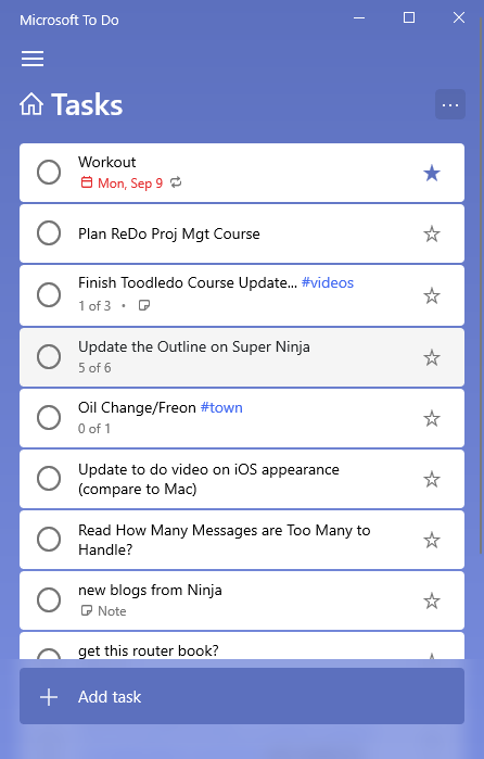
They have put a dark background around the entire list now (instead of just at the top). The task body remains white but now have rounded corners. Most notable is that the dark background shows between the tasks, making each task stand out a bit.
As far as I can tell, there is no functional difference. Though a few more controls are added at the right end of the new task line, as an alert reader pointed out in comments below.
I’ve seen this change appear in the Windows 10, iOS, and Android apps, but not in the web version yet.
Don’t forget I’ve got an 18-video course on how to use Microsoft To-Do with my simple 1MTD tasks system.
There is a small icon now in the task entry field to put a due date while entering the task. This is in the Windows 10 app. Another icon allows to set a reminder.
Also the sidebar can be adjusted in size in Windows 10.
Most “important” change: They got rid of the dash in “To Do”. 😉
The task entry box now has a little icon that allows you to enter a due date when starting the task. The Windows 10 app has this. Reminders can be set using a different icon. retro bowl college
In Windows 10, you may also change the size of the sidebar.
The revamped To Do apps look sleek especially with the dark background. Minimal changes but aesthetically pleasing. Waiting for the web version to join the party.
Real Estate Consultant in Stuart FL
You can now add a due date when you start a task by clicking a little icon in the task entry field. Your Windows 10 app includes this. A different icon can be used to set reminders. Monkey Mart
Sharing scores with friends makes Chicken Road more exciting. Competing for the highest number brings laughter, rivalry, and endless replay. The social element transforms a simple arcade into a fun group challenge.
The game space waves is appropriate for all players, from novices to experts, because it strikes a balance between ease of use and complexity. The replay potential of the game is another appealing feature.